Modules
...
Forms V2
Elements
Radio Button
7min
Radio Buttons are often used in situations where a user needs to make a binary choice(e.g., 'yes' or 'no') or select a single option from a list of possibilities.

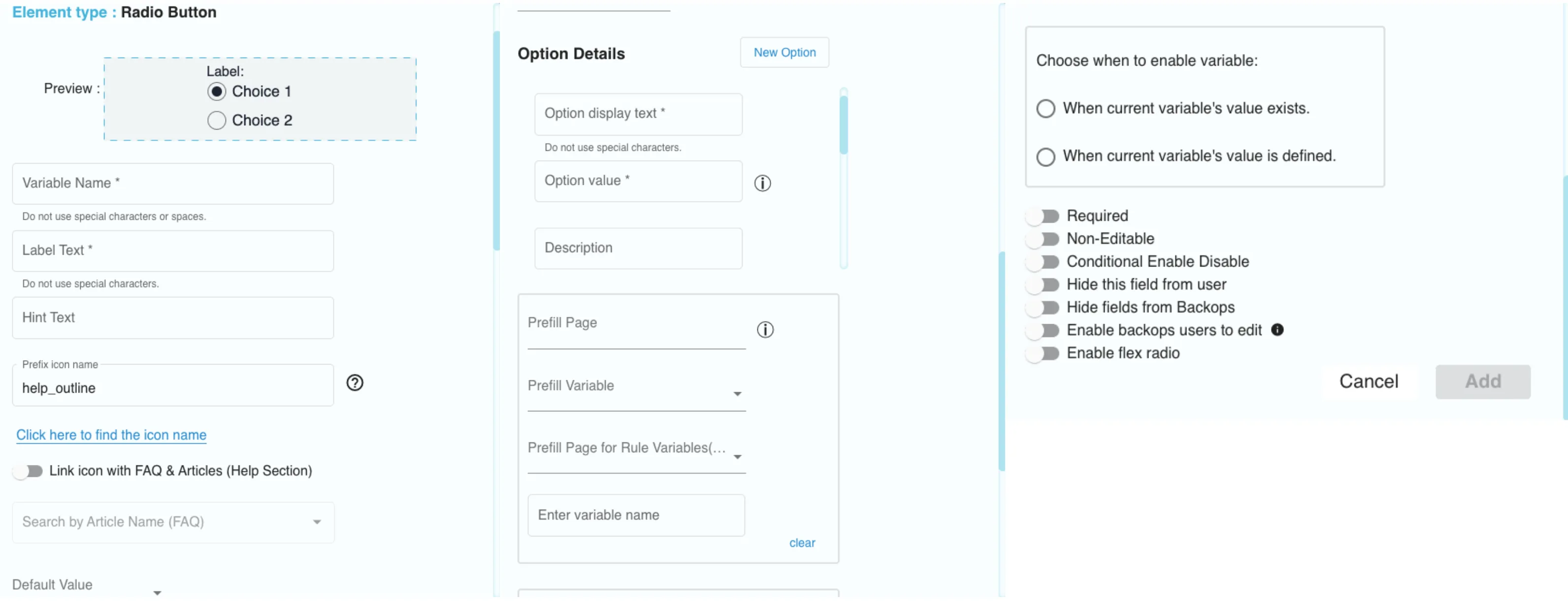
Element Details of Radio Button
- Variable Name: The variable that is used to identify the element is entered here.
- Label Text: Label text is entered here.
- Hint Text: This is used so that the user can better understand what the element is used for.
- Prefix icon name: The desired prefix icon can be configured from here which will be displayed.
- Default Value: The default value for the radio button options can be configured here if none of the options are selected.
- Option display text: The text to be displayed for the option can be configured from here.
- Option value: The value for the variable can be configured from here.
- Description: The description for the option displayed can be configured from here. (format used: #pageid.variableName)
- Trigger Subpage Toggle: This toggle can be enabled for triggering a subpage by selecting the option.
- Prefill Page: The page from the flow that we want to pull the prefill data can be chosen.
- Prefill Variable: The prefill variable can be chosen from the prefill page using this drop-down.
- Prefill Page for Rule Variable (Arithmetic): This dropdown is used to select the rule page for prefill items.
- Enter variable name: This is used to enter the prefill rule page variable.
This is used to select when to enable the variable depending on the condition such as:
- To enable when the current variable’s value exists.
- To enable when the current variable’s value is defined.
- Link icon with FAQ & Articles (Help Section): By enabling this, the icon can be linked to the FAQ & Articles(Help Section).
- Required: To enable whether to make the variable required or not.
- Non-Editable: To enable whether to make the field input value non-editable or not.
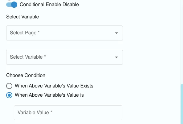
- Conditional Enable Disable: If the element is non-editable this feature will make it editable and if the element is editable this feature will make it non-editable based on the condition. Select the page and the variable on that page. Then choose from the conditions, i.e., 'When Above Variable's Value Exist's or 'When Above Variable's Value is', and choose the value of the variable for the second condition. So, when the value of the chosen variable on the selected page exists or has a certain defined value based on the condition, then this element, here, the radio button can be enabled/disabled. (Note: This is not implemented yet in the RM app)

Conditional Enable Disable
- Hide this field from user: This toggle is given to enable the option to hide the selected field of the element from the user’s view.
- Enable backops users to edit: This toggle enables backops users to edit the field and override the customer's input.
- Enable flex radio: Enabling this will make the radio button position as a flex in the user view.
Getting help
Please feel free to contact us if you have any questions, require clarification, or have ideas for how to make the documents or any of our services better.
You can reach out to us at [email protected].